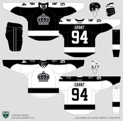
Here a four LA Kings concepts. All of them use the same striping pattern, the only thing different between them is their colour scheme. The striping pattern for all of them are inspired by the Kings 1980-88 set. I used a version of their retro crown logo as the primary logo, and a re-coloured version of this logo as the shoulder-patch.
Option 1: A simple purple and white colour scheme. They would have their own colour scheme for the first time in franchise history (no more copying the Lakers, Raiders, or Sacramento Kings).
Option 2: Same as concept one, but with silver added (same colour scheme I used for them in my NHL Redesign). This colour scheme would also be unique to them.
Option 3: Similar to option 2 but re-coloured in their current colour scheme.
Option 4: Just like option 2, but Vegas Gold replaces silver. This colour scheme could be seen as an update to their original colour scheme.
Any thoughts on which concept is better?


If I had to choose one, I'd go with option 1. Although, I would go with the current set over all of these.
ReplyDeleteoption 3 is my favourite
ReplyDeleteAll of these are great but Options 2 and 4 are my favorite. I'm glad that you went with the crown from the chevy logo. I just started a concept with it as well.
ReplyDeleteSorry not chevy. I meant 60's-70's alt.
ReplyDeleteThanks everyone for the feedback.
ReplyDelete