October 11, 2015

Team NASA

What if NASA were a hockey team?  I know that's a very random question, but it's what inspired this concept.

Team NASA:
The red stripes are based off of the red stripes that are on some NASA spacesuits (see below).  I was also a bit inspired by the all blue NASA flight suits.  Overall I was just going for a simple look that was a mix of both modern and traditional.

Image from wikipedia.org - Image from nasa.gov
Just in case you're curious, here's some more info about the above photos.  The first photo is of Alan Shepard on the moon during Apollo 14, taken by astronaut Edgar Mitchell.  The second photo is of astronaut Scott Kelly inside a Soyuz simulator.  Kelly is currently in space as commander of the International Space Station.  If you are at all interested in outer space you should follow Scott Kelly on Twitter or Instagram, he posts lots of spectacular photos.

Bon Voyage!

September 26, 2015

Silver (Grey?) Canucks

Hello again!  It's been a while (sorry about that).  I  just haven't had any ideas for new concepts lately, hopefully that will change now that hockey season is about to start.

Vancouver Canucks:
The Canucks should not have a silver third jersey (or is it grey), they should have a green third jersey (Trevor Linden, if you're reading this do not make this concept a reality (although it would be cool having the Canucks wear a jersey I designed))*.  But even though I dislike the idea of a silver Canucks jersey, I thought it was worth it to create this concept anyways.

Aloha!

*I think I use brackets too often.

June 13, 2015

New Coyotes

Arizona Coyotes:
The Coyotes are set to unveil new uniforms during the NHL Draft on June 26 (unless they move before then).  I'm actually a fan of their current set, so I kept some features of those uniforms around when creating this concept.  I originally planed to use maroon equipment, but ended up deciding black fit the jerseys better.

I also changed up the blog's design a bit.  I felt there was too much unnecessary clutter and I wanted the focus to be on the concepts, so I got rid of the sidebar which now allows me to make the images bigger.  You can now find the blog archive and the links to the Templates and About SG-94 page at the bottom of the blog.

Thanks for visiting!

April 15, 2015

Goodbye (Kind Of) After Three Years

This blog was started three years ago today, and I've decided it's (kind of) time to shut the blog down.  I will still post any concepts I make here (if I make any more concepts), but it will likely be a long time between posts.  However I will no longer be posting guest concepts, or doing any "My Thoughts" posts.

Also, I put together this image of how the blog's logo has changed over time...

Hopefully I'll be back with more concepts, but it will likely be at least a couple months from now.

Enjoy the rest of your day!

March 28, 2015

Guest Concept Post #78

Hello again!  It's been a while since the last post.  That's simply due to a combination of me being busy and having no ideas for new concepts.  But I'm back today with a guest concept from Scott.

Edmonton Oilers, by Scott:
The Oilers have had two good sets of jerseys in their history (the Gretzky-era/current look, and the pre-edge set), and Scott has combined them both for this concept.  I like the use of silver, especially on the striping of the home jersey because it helps separate the orange stripe from the blue background.  However, I think the elements without silver (numbers, collars, pant stripe, and away yoke) now look out of place.  I suggest adding silver to those elements which I think would make the whole uniform more cohesive (although it might end up looking worse, hard to tell without seeing it both ways).  As it is now, I prefer the Oilers current jerseys to this concept, but I like this concept better than their pre-edge jerseys.

Have a good day!

March 05, 2015

Sharks Tweak

San Jose Sharks:
I think the Sharks current jerseys are decent but could be improved with a few changes, so that's what I did here.

Thanks for visiting!

February 15, 2015

Stadium Series Predictions

2016 Stadium Series:
A couple weeks ago I posted my prediction for next year's Winter Classic jerseys, today I'm doing the same for the Stadium Series.  I think the jerseys will once again be modern, and follow a template that is used for all four teams.  I also kept the the giant sleeve numbers and giant pant logos from this years uniforms.  I decided against white pants, instead using white gloves for the road teams.  Also gone are the chrome or carbon fiber logo, but that's mostly just wishful thinking.  The sleeve stripes are angled so that when the arms are down at an angle the stripes will look more vertical to match the stripes on the torso.

Also, I've added a square yolk variation of my new template to the templates page.

Enjoy the rest of your day!

February 09, 2015

Guest Concept Post #77

Boston Bruins Winter Classic Jerseys, by Adam:
Today we have three Bruins Winter Classic concepts by first time contributor Adam, all of which are true throwback jerseys.  I'd love to see the Bruins go with a throwback jersey, I thought the Winter Classic was best when the teams wore actual jerseys from their past, and it lost a bit of it's charm when teams starting making up fauxback jerseys.  This jersey is from 1974-95, and while it's not one of my personal favourites it would be a great option because it the Bruins' longest lasting jersey.  It's also fitting that this concept is posted on the 77th guest concept post, because whenever I see this jersey I think of number 77 Ray Bourque.

The second throwback jersey Adam suggested is much older, dating back to 1949-55.  The logo on this jersey is a great throwback logo, it was used for 22 seasons before the Bruins switched full-time to their famous spoked-B logo, so it has a lengthy history and it simply looks great in my opinion.  The jersey striping once again isn't one of my favourite looks for the Bruins, but I'm sure lots of people would love it.

Adam's final suggestion is my favourite of the three, and it's also the oldest being a throwback to the Bruins very first jersey from 1924-25.  This jersey is actually pretty unique, it's the only brown jersey in NHL history (you could argue that the Bruins 1926-32 jersey was also primarily brown but I've always thought of it as a white jersey).  Not only is this jersey unique but it also has a lot of old-timey charm that's perfect for a Winter Classic, especially the logo.  To be completely historically accurate the pants would have to be tan, but I don't think the brown pants look bad either.

Have a good day!

February 06, 2015

Back in Silver

Hello all!  I have some good news for anyone who uses vector graphics to make concepts (or anyone who wants to learn how).  Nick Burton has created a vector version of my hybrid template, which you can find on his blog Burton Hockey Design.  He also made a tutorial that would be very helpful for anyone learning to make vector concepts.  In other news, I have a new concept to show you folks.

Los Angeles Kings:
This concept is inspired by both the Kings' current jerseys and their 1980-88 jerseys.  I had wanted to try a silver Kings jersey for a while, and I thought it would look best if they was a good amount of black.  However that causes a bit of a problem because the jersey might be to dark for a light jersey and to light for a dark jersey, but since this is just a concept I'm not going to worry too much about that detail.

Thanks for visiting!

February 01, 2015

Winter Classic Prediction

2016 Winter Classic:
For the 2016 NHL Winter Classic I'm predicting that the Bruins will wear a yellow fauxback jersey, while the Canadiens will wear a white throwback jersey.  The striping for the Bruins jersey is inspired by the socks they wore from 1939-67, and the Canadiens jersey is from 1941-44.

Enjoy the rest of your day!

January 24, 2015

Johnny Canuck Part Two

Back on the 15th I wrote a post about Johnny Canuck which included a home and road concept for the Canucks.  Today's concept is a third jersey to go along with that set.

Vancouver Canucks:
This is also an updated version of a concept from March 2013.  The striping is partly inspired by the Canucks' infamous "Flying V" jerseys, but with Johnny Canuck on the front instead of a giant V.

Also, I've added this variation of the template (with the collar-to-cuff yoke) to the Templates page.

Have a good day!

January 18, 2015

Guest Concept Post #76

Sherbrooke Phoenix, by Jake88:
The Sherbrooke Phoenix are one of the youngest teams in the QMJHL but that didn't stop Jake88 from designing a very retro third jersey for them.  The vintage look goes very well with vintage white that Sherbrooke uses (it actually makes a lot more sense than the Blues 2007-14 template that they use for their home and road jersey), however I don't think the logo fits with such an old fashioned jersey.  Maybe their wordmark logo would be a better fit.  Execution is great as it always is from Jake, and I'm also a big fan the presentation/layout he's been using lately.

Thanks for visiting!

January 15, 2015

My Thoughts: Johnny Canuck

Hello once again!  Today I'm going to talk about my favourite team the Vancouver Canucks, specifically their full-body Johnny Canuck logo.

Image from instagram.com/canucksstore
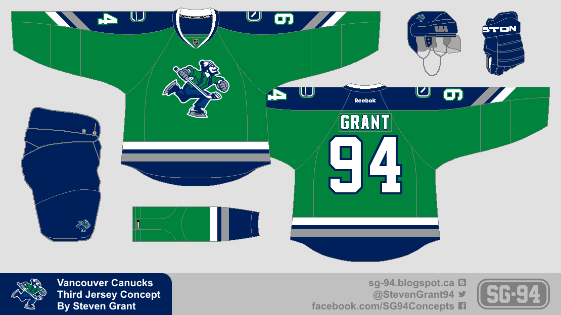
Back in November the Canucks released a green fashion with Johnny Canuck as the main logo.  Even though I love the colour green, I wasn't a big fan of the jersey.  The striping gets a bit muddled where green touches blue, the collar looks weird with no blue, and the logo is too small and too high.  But the jersey did get me thinking about Johnny Canuck's potential as Vancouver's primary logo.

As a Canucks fan I love the idea of Johnny Canuck as the primary logo.  There is a nice history behind the logo, it's an updated version of the logo used by the WHL's Vancouver Canucks (who were a predecessor to the NHL team).  The current Canucks have also made Johnny Canuck a bigger part of their brand recently, by partnering with a Johnny Canuck impersonator who makes cool videos (that impersonator now makes videos that appear on the jumbotron at Canucks games).

That being said, I still have some doubts about the Johnny Canuck logo (you might notice that in both my NHL De-Edge Series and NHL Redesign Series the primary logo was the stick-in-the-rink).  It is a bit cartoony, and it's irregular shape can look odd on some applications.  However, my doubts are fading more and more everyday, and I'm becoming increasingly convinced that Johnny Canuck should be the main logo.  But there is one change I think the Canucks should make before they promote it to the primary...

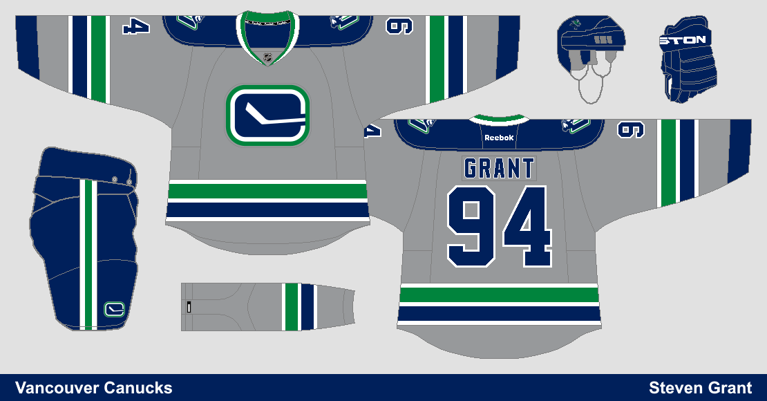
And that change has to do with the outline around the logo.  With the thin silver outline the Canucks currently use, the logo gets lost a bit on dark backgrounds.  I'd much prefer a thicker white outline, which I believe really helps the logo stand out.

That wouldn't be the only change I'd make to the Canucks brand though, I'd also retire some of their other logos.

Actually the only other logo I'd keep would be the stick-in-the-rink.  I think it's perfectly suited to be a secondary logo, and it looks great on the shoulders and pants of the Canucks current uniforms.  On the other hand I'm not a big fan of the Johnny-V logo, I've always thought it was awkward how the head was attached to the V and it's also too similar to the logo used by Vachon Inc.  Another logo I don't like is the orca logo, it just doesn't really represent the team name and it's corporate origins don't sit well with me (the logo debuted when the Canucks were owned by Orca Bay Sports and Entertainment).  The last logo I'd get rid of is the Millionaires-V logo, I don't mind it on the Millionaires throwback jersey but I think it's too primitive to work as a full time logo today.

If the Canucks were to switch logos, I'd also want them to update their uniforms.

For the most part I really like the Canucks current uniforms, so I just made some small changes like adding green to the collars, altering the thickness of some stripes, and using a block font (and of course replacing the orca with Johnny Canuck).  Another reason I only made small changes is that the Canucks have had a major identity problem over the years, and I feel it's time for them to establish a consistent look.

So those are my thoughts on the Johnny Canuck and the Canucks brand overall.  If you have any thoughts on this topic, feel free to share them in the comments.

Enjoy the rest of your day!

January 10, 2015

Guest Concept Post #75

Vancouver Canucks, by Jake88:
Today we have a couple of concepts by Jake88, starting with my favourite team the Vancouver Canucks.  The striping pattern here is inspired by the Canucks 90's jerseys, and I think it looks really good.  One small change I'd suggest is for the white jersey only, moving the silver stripe in between the green and blue stripes, because I think it's best when green and blue don't touch (and I know some people don't like mismatching jerseys, but I think it would work in this situation).  Other than that I wouldn't change anything, I like the number font, and I really like how the pants logo is done with the green and silver outline to match the primary logo.

Ottawa Senators, by Jake88:
Jake also sent in this concept for the Senators, which brings back the laurel leaf pattern from their 2000-07 third jersey.  That pattern is sublimated here though which is a great idea, overall I think the whole striping pattern looks great.  Besides the sublimated laurel leaf pattern, the other unique feature is the shape of the shoulder yoke.  I love the shape of the yoke on the front of the jersey, but I think the back is just too round, which might cause problems for longer names.  My only other complaint is that the logo on the red jersey could use an outline.  I like everything else about this concept (equipment, fonts, etc).

Have a good day!

January 05, 2015

Guest Concept Post #74

Hello folks!  You might notice that I skipped from Guest Concept Post #72 to Guest Concept Post #74.  Turns out I forgot to label a post with a guest concept a long time ago, so all the posts up to today have been off by one.  Oh well.

Columbus Blue Jackets, by Jake88:
To start off this correctly numbered post we have a Blue Jackets concept by Jake88, and it has a sash!  A SASH!!!  I like the sash, it's a unique element that you don't see used very often and it looks good too.  I'm also a fan of the sleeve stripes with the star in the middle, and the name and number fonts are a perfect fit.  Lastly, while I normally hate vintage white, I have to say it doesn't look bad in this situation (although I think normal white would look just as good).

Bowling Green State University, by Leo:
We also have a Bowling Green State University concept from Leo, and it has mismatching jerseys!  MISMATCHING JERSEYS!!!  I actually don't mind the mismatching jerseys, I'm sure some people wouldn't like them but luckily I'm not one of those people (in fact back when I used to play NHL07, I'd create custom teams with mismatching jerseys).  The only changes I'd make are with the numbers, not the striping.  First of all I think white numbers would work better on the orange jersey, and I also think the sleeve numbers on both jerseys need to be about 48% bigger and have an outline.  Lastly, on the back view of the jerseys the sleeve number should be a one instead of a five.

Thanks for visiting!

January 01, 2015

New Template and a Ducks Concept

Happy New Year!

To start off 2015 I have a new template to unveil, and a Ducks concept using that template, but before we get to those I also want to state a new rule for guest concepts.  From now on I'm only going to accept concepts that are for actual hockey teams.  That means concepts for movies, TV shows, video games, other sports, Swedish superstores, etc, will no longer be accepted.  This new rule is simply because I enjoy reviewing concepts that are for actual hockey teams more than other concepts.

Now here is that template I was talking about...
This template is a hybrid of the template used on The (unofficial) NHL Uniform Database and the template from the Paint Users Paradise 2.0 thread on the Sportslogos.net forum (which is why I call it the "NHLuniforms.com/Sportslogos.net Hybrid Template").  It is mostly traced from an image on The (unofficial) NHL Uniform Database, but with the arms perpendicular like the Sportslogos.net template.  The collars are also from the Sportslogos.net template (with some alterations done by me).

This template can be found on the Templates page, along with some extra collars and stuff to go along with it.

Anaheim Ducks:
To try out the new template I created this Ducks third jersey concept.  It's another attempt at using no white in the stripes (previous attempt here).  Those stripes are somewhat inspired by the collars on their current home and road jerseys.

Lastly, I made a minor change in the look of the blog by adding a white stripe behind the links to the pages.

Enjoy the rest of your day!