

December 30, 2012
IIHF Redesign - Germany
Germany:
 I really like how Germany's current uniforms use their flag as the striping pattern, so I kept that. I just changed up a few minor things that bugged me.
December 28, 2012
IIHF Redesign - Finland
Now that the holidays are over I'm continuing my IIHF Redesign.
Finland:
 These jerseys are somewhat inspired by their current jerseys. I changed up the placement of the stripes to something I liked better.
Finland:

December 23, 2012
IIHF Redesign - Czech Republic
Czech Republic:
 This is inspired by their current uniforms, but I changed it up too look less like a Nike Swift template. I also made blue more prominent on the red jersey.

December 21, 2012
IIHF Redesign - Canada
HJC is still down. Colin posted his HJC post to his blog, like I did yesterday. If you haven't seen it yet click here.
This is the first post of my IIHF Redesign. I will be posting the teams alphabetically, starting today with Canada. Expect new teams every couple of days.
Team Canada:
 I used my Team Canada third jersey concept from August as inspiration for this, with the arm-stripes using hidden maple-leafs. Black is still around, but it isn't used anywhere on the striping.
This is the first post of my IIHF Redesign. I will be posting the teams alphabetically, starting today with Canada. Expect new teams every couple of days.
Team Canada:

December 20, 2012
HJC's Wednesday Post
As I'm sure all of you know, Hockey Jersey Concepts is currently down right know. Ryan has asked me to post my weekly post on my blog, so here it is. It will probably be a bit shorter than normal, since I'm trying to get it posted tonight. Also in SG-94 news, expect to see some IIHF concepts in the next few days, I'm doing a full IIHF redesign for the world juniors.
Since we can't see the nominees for any votes, there are no voting reminders for me to post. Also the deadlines will probably have to be extended, I'm not sure.


----------------------------------------------------------------------------------------------------
Since we can't see the nominees for any votes, there are no voting reminders for me to post. Also the deadlines will probably have to be extended, I'm not sure.
----------------------------------------------------------------------------------------------------
Denver Nuggets (by Mike S.)

This concept is inspired by the actual Nuggets alternate uniform. I do like that fact, but I really think that this whole series is hurt by using nothing but wordmarks. Hockey jerseys don't normally use wordmarks, so these don't work as hockey concepts in my opinion. 6/10
CSKA Moscow (by Stephen T.)

The striping is really good, and the logo, which seems inspired by this logo, isn't that bad (besides being pixilated). There are a few execution errors, the shoulder yoke is different on one side of the front of the white jersey. Also the back of the collar on the white jersey is different than the front. 7/10
Minnesota Wild (by WinnipegJets96)

My only real comment here is that the jerseys are very traditional for a team with such a modern name and logo. They do look really good, but personally I'd rather see something modern. 7/10
Green Bay Packers (by Brian B.)

The Packers are a team that should use traditional jerseys (they've been around since 1919). These look actually like what I'd expect a Packers hockey jersey would look like, I have no complaints at all. 8/10
Los Angeles Kings (by WinnipegJets96)
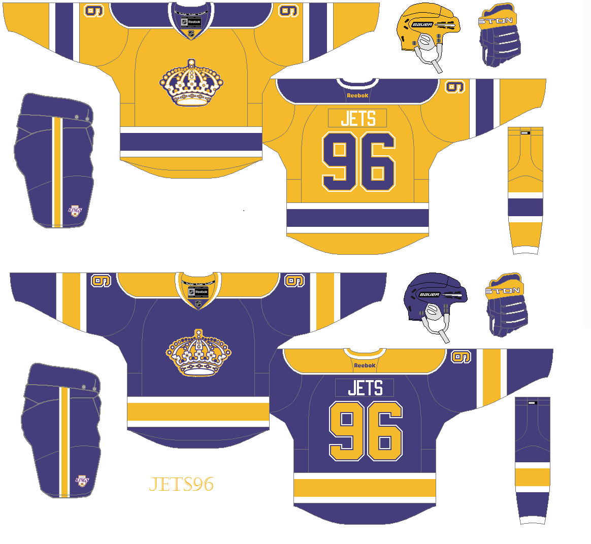
These jerseys look like a mix of the King's 1967-80 uniforms and their 1980-88 uniforms. I like these much better than the Kings current colourless uniforms (which I don't like very much). My only suggestions are to only use a single outline on the numbers, and move the logos up a tiny bit. Other than those minor issues, these a very good. 8/10
Chicago Blackhawks (by Kyle C.)

Even though I would never want the Blackhawks too change their jerseys, I love seeing concepts that do exactly that (when done well, like this concept). The striping looks great for an original six team, and it appears to be a modern version of the Blackhawks' old barber-pole jersey. Adding yellow to the striping really makes it "pop". Also the logo mash-up looks great. COTW nomination from me!!! 9/10
Santa concept (by Joey A.)

I just had to save this concept for last, I love the Christmas spirit shown here. The jersey itself looks very good too, I could definitely see a minor league team wearing this. My only suggestion is to have the rear hem-stripe (white) go all the way down to the hem to better match the front of the jersey. Take a look at the hem stripes on some of these jerseys if you don't get what I mean. 9/10
December 15, 2012
It's Beginning To Look A Lot Like Christmas
It's currently snowing at my house for the first time this year. I thought it was a good time to change the banner at the top of the page to something festive. I'd like to wish everyone a Merry Christmas, or Happy Hanukkah, or whatever else you celebrate.
I don't have any concepts today, but I'm planning on doing some international concepts for the World Juniors. I also tried to do some concepts for defunct teams, as Adam suggested a few weeks ago, but I really had no good ideas.
I don't have any concepts today, but I'm planning on doing some international concepts for the World Juniors. I also tried to do some concepts for defunct teams, as Adam suggested a few weeks ago, but I really had no good ideas.
December 09, 2012
Throwing Some Ideas Around
I had a few ideas for concepts floating around in my head, but I didn't know what teams to use them for. I decided to make them and throw on some NHL and NHLPA logos. Neither of them turned out exactly as I thought they would, but I'm posting them anyways.
NHLPA Concept:
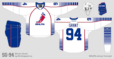 I had this idea for gradually smaller and smaller stripes. It's crazy, but maybe it could work for a minor league or beer league team.
NHL Concept:
 I also wanted to make a hockey concept with pinstripes. I still think an NHL team could use pinstripes, so maybe I'll try this again in the future.
NHLPA Concept:

NHL Concept:

December 01, 2012
Another New Look
As you probably noticed I changed up the look of this blog again. I know I've done it quite often, but I truly believe I won't get tired of this new look for a long time. Here's a rundown of what's new...
Appearance Wise
Feature Wise
So that's what is new. I'll get back to posting concepts soon.
Appearance Wise
- Green is lighter.
- Shield logo is gone, replaced by my wordmark (I seem to dislike my logos after a while, but my wordmark has been the same for each logo).
- Black is added as a secondary colour.
- Light grey is used as the main background.
Feature Wise
- I've now added a Facebook page.
- I'm accepting contributor concepts again.
- I've gotten rid of the blog list on the side of the page. Replacing it with a Links page.
- I've added a some quick link icons to the side of the page. Including a link to my Twitter page, Facebook page, email address, and some pages on SG-94. Those pages are my NHL Redesign, My Jersey Collection, and my What If series for the Jets and Nordiques (those two posts were the most popular page-view wise on this blog by a wide margin). Just click the icons to go to the link.
So that's what is new. I'll get back to posting concepts soon.
November 29, 2012
Rockies Third 2.0
Colorado Rockies:
 After looking at my previous Rockies concept, I started to think there was too much yellow. So I updated it with more red.
Also the poll is tied. Someone break the tie.

Also the poll is tied. Someone break the tie.
November 27, 2012
Rockies Third
Check out the poll to the right of the page.
Colorado Rockies:
 I used the Colorado state flag as inspirational for the striping. Yellow is used as the base colour for something different.
Colorado Rockies:

November 15, 2012
Jets Third
I am officially scraping the bottom of the barrel for ideas, with my recent BCHL concepts and now this.
Winnipeg Jets:
 I took the stripes from the sleeves on their primary jerseys and used it throughout this concept. Logos, fonts, and equipment are all the same as their current jerseys. Like I said before, I'm running out of ideas.
Winnipeg Jets:

November 06, 2012
Chilliwack Chiefs
Chilliwack Chiefs:
 Time for another BCHL concept. These are probably very boring for anyone outside of BC, but it's better than nothing. I took their current uniforms and changed a bunch of things to make them more interesting. The font for the name and number is Koftsman, which I got from Alan's website AJH Hockey Jersey Art.
I'll try to have more posts up soon, but I can't make any promises.

I'll try to have more posts up soon, but I can't make any promises.
October 27, 2012
Surrey Eagles
You probably read that title there and said to yourself "Who?". The Surrey Eagles are a team in the BCHL (a Junior A league here in British Columbia). Here is a link to their photo gallery section of there website, so you can see what their current jersey look like. I've decide to do some concepts for the BCHL because I'm out of Ideas for NHL teams.

Surrey Eagles: I used the jersey worn by the eagle in their logo as inspiration for this concept. I then used a green jersey as the coloured jersey because I like the colour green.

Also sorry for the long time between posts. I had no ideas for new concepts, and I've been busier than normal lately. Hopefully I'll have more posts now that I'm doing some BCHL concepts.
October 17, 2012
Wild Contest Entry
Minnesota Wild:
 This is my entry for HJC's Minnesota Wild Redesign competition. The striping is a more traditional take on the Wild's original jerseys. The logos are the same as what were used for their first ten years of existence.

October 15, 2012
One Team, Four Cups
New York Islanders:


We all know the Islanders love using symbolism for their four cup wins, with the four stripes in their current logo and their previous alternate logo. So I created this third jersey with four stripes to continue that history of symbolism.
October 11, 2012
Quick Update
-ongreen.png)
October 10, 2012
Predators and Pink
Jersey News

 |
| (Image from www.sagueneens.com) |
The Chicoutimi Saguenéens of the QMJHL wore special uniforms last night to raise awareness for breast cancer research. They look like most other breast cancer awareness jersey, lots of pink added, and using features from their regular jerseys.
 |
| (Image from www.saskatoonblades.com) |
Also, the Saskatoon Blades of the WHL will be wearing special event uniforms for their October 20th game against the Everett Silvertips. The jersey features a new roundel logo for the event, and has an awesome feature in the bottom stripe. The bottom stripe will include a list of names of Blades season ticket holders' family members and friends who have lost their battle with cancer.
Concepts
Nashville Predators:

I like the Predators current colour scheme, but I also really liked the striping on their original uniforms. So for this concept I tried to combine the two, while also changing a few things. The current logos and numbers are used, but the NOB is slightly different. The stripes are the same for all three jerseys, just the main part changes colour.
SG-94 Concept:

I've been using a blank shield as a logo more often recently (Twitter logo, favicon, and on my template) so I had to see what it would look like on a concept. Then after I made the concept I had to post it here. I tried to make it look vintage with a chest stripe, shoulder numbers, and a box around the back numbers (similar to a name bar).
October 05, 2012
Johnny Canuck
Vancouver Canucks:

The home and road are updates to their original (and current) uniforms, with the updated "Stick-in-the-Rink" logo on the front. Johnny Canuck is used on the shoulders and helmets. The third jersey is green (almost just a re-colour of the home), with skating Johnny as the main logo, and the interlocking VC logo as a shoulder patch.
Hopefully I'll make a few more concepts sometime soon.
September 28, 2012
New Look, Old Concept
I updated the look of the blog a bit. No new logo, but I changed the Header (top of page), and the background (getting rid of the diamond pattern). I updated my template too, also getting rid of the diamond pattern there. Below is a look at the updated template, and here is the same concept on my old template to compare.
Also, I haven't made a lot of concepts lately, mostly due to a lack of inspiration. So don't worry if this blog isn't updated for a while, it isn't going anywhere.
 |
| A look at my new template. |
September 26, 2012
Dark Flames
Calgary Flames: The striping is inspired by both their current jerseys and their original jerseys. I used gradients because it reminds me of the look of fire when it's dark out. Also the shoulder-patch is the old Calgary Cowboys logo (in think the Flames should buy the rights to that logo, similar to how the Canucks bought the Millionaires logo).

Thanks for visiting.
September 22, 2012
Kings Concepts
Here a four LA Kings concepts. All of them use the same striping pattern, the only thing different between them is their colour scheme. The striping pattern for all of them are inspired by the Kings 1980-88 set. I used a version of their retro crown logo as the primary logo, and a re-coloured version of this logo as the shoulder-patch.
Option 1: A simple purple and white colour scheme. They would have their own colour scheme for the first time in franchise history (no more copying the Lakers, Raiders, or Sacramento Kings).

Option 2: Same as concept one, but with silver added (same colour scheme I used for them in my NHL Redesign). This colour scheme would also be unique to them.

Option 3: Similar to option 2 but re-coloured in their current colour scheme.

Option 4: Just like option 2, but Vegas Gold replaces silver. This colour scheme could be seen as an update to their original colour scheme.

Any thoughts on which concept is better?
September 18, 2012
Green and White Whalers
My original idea for a Whalers concept was to just use green and white. I got distracted by the Nordiques though, but when winnipegjets96 suggested I use just green and white I thought I'd give it a shot.
Hartford Whalers: As I said, just a simple green and white colour scheme. Simple striping, but I changed the position of the arm-stripes to make it different than the Red Wings.

Thanks for visiting.
Hartford Whalers: As I said, just a simple green and white colour scheme. Simple striping, but I changed the position of the arm-stripes to make it different than the Red Wings.

Thanks for visiting.
September 17, 2012
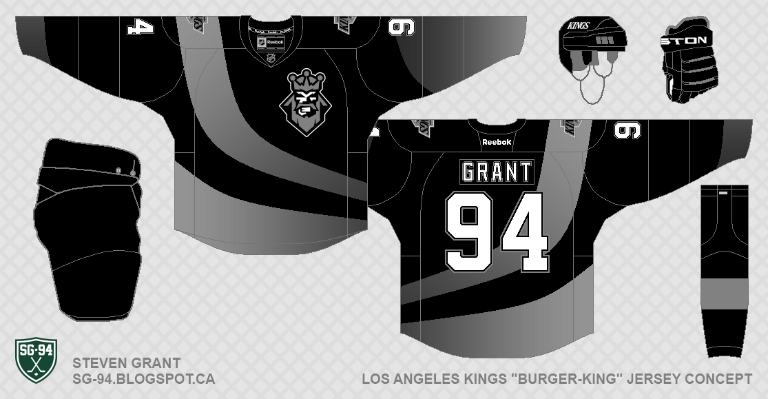
LA Burger-Kings
Here is a post dedicated to the LA Kings "Burger King" logo. The first concept was actually made before Ryan announced the "Make the Burger King logo look good" contest. The second jersey is my entry for the contest.
Jersey Update: For this concept I was just trying to improve the Kings "Burger-King" jersey. I made the base-colour black, removed the purple and gold, changed the name and number font, and gave the jersey their own socks. I also updated it to the Reebok Edge jersey system.

Contest Entry: I made a silver jersey with the Burger King logo front and center. I also replaced all the purple in the logo with silver. The equipment is the Kings current equipment.

I'll be posting some more normal King's concept in a few days.
Jersey Update: For this concept I was just trying to improve the Kings "Burger-King" jersey. I made the base-colour black, removed the purple and gold, changed the name and number font, and gave the jersey their own socks. I also updated it to the Reebok Edge jersey system.
Contest Entry: I made a silver jersey with the Burger King logo front and center. I also replaced all the purple in the logo with silver. The equipment is the Kings current equipment.

I'll be posting some more normal King's concept in a few days.
September 13, 2012
Whalers Inspired Nordiques Concept
Quebec Nordiques: Here's part two of my crazy idea to switch jersey designs for the Whalers and Nordiques. I used the Whaler's 1985-91 jersey as inspiration, and used a modified version of the Nordiques igloo logo.

Thanks for visiting.

Thanks for visiting.
September 11, 2012
Nordiques Inspired Whalers Concept
Hartford Whalers: I had a crazy idea to make a Nordiques inspired Hartford Whalers concept. Pucky replaces the Fleur-de-lis, and I edited the Whalers primary logo to look more like the Nordiques' igloo logo.

In a few days I'll post a Whalers inspired Quebec Nordiques concept.

September 06, 2012
WE WANT FISH-STICKS!!!!
New York Islanders: This concept is inspired by a monkey's scarf (long story). Anyways, I was trying to make the Fisherman jerseys less awful. The striping pattern, numbers, and NOB are all simplified. The primary logo was also changed a bit.

Do you think these jerseys would be accepted better than the actual Fisherman jerseys?

Do you think these jerseys would be accepted better than the actual Fisherman jerseys?
September 03, 2012
My Least Favourite jerseys
For my phase 2 post on HJC I talked about my top five favourite jerseys in the NHL right now. I thought I'd post here on SG-94 about my least favourite jerseys in the NHL right now. This time though I'm posting a Top Ten list (I have lots to complain about). I also have one rule, that I can only have one least favourite jersey per-team. Remember that these are just my opinions, so feel free to disagree with me. Also, all the images in this post are from Icethetics, and the titles of each jersey are links to their page on The (unofficial) NHL Uniform Database.
10: Boston Bruins Third
I dislike the Bruins third jersey for a few reasons. First of all, they used black socks for the first in franchise history. Not only does it ruin tradition, I also think it just looks bad. The sleeve striping appears lazy to me (just copied from their home jersey), and the lack of hem-stripes look bad on this jersey. My final complaint is the logo, which I think looks much better as shoulder-patch. The bruins colour-scheme still looks great though, which helps this jersey a bit.
9: Anaheim Ducks Third
Most people are a fan the Ducks third jersey, but I think it's an eyesore. The large orange area at the top of the socks are my least favourite part, it stands out way too much. I also think all the orange piping is unnecessary and just clutters up the jersey up. I am a fan of the logos though, which saves this jersey from being lower down on this list.
8: Ottawa Senators Road
I'm not a fan of over-used templates, and this jersey template is one of the worst. It's used by the Senators and Penguins (and formerly the Lightning). I think the Penguins use this template slightly better, which is why I chose the Senators for this list. Another thing I don't like about this jersey is the ugly font used for the numbers. The side-profile logo would also be nice to see on a Senators jersey, instead of the front-facing logo on this jersey.
7: Calgary Flames Road
During the Reebok Edge takeover in 2007, the flames went from having one of my favourite jersey sets to one of my least favourite. I don't mind the side-panels, but I don't like the piping, the flag shoulder-patches, or the trim at the hem. The jersey is just too busy, if it were simplified it might not be on this list. Also the side panels on the home jersey match the pants better, which is why the road jersey makes this list instead of the home.
6: Florida Panthers Home
I was very excited when I heard that the Panthers were returning to red for the colour of their home jersey. But when it was revealed I was very disappointed. The jersey has major contrast problems, due to the lack of white. Also the striping is kind of boring, since it was just copied from their previous jersey. The logos are still nice though, and the use of more red is good.
5: Tampa Bay Lightning Third
The Lightning have three of my least favourite jerseys right now. I had to pick just one, and the "Bolts" word-mark is what causes this jersey to make the list. In my opinion, using a nickname as a logo is very amateurish and should never happen in the NHL. The piping also makes this jersey look bad. The actual striping is good though, which is why this jersey isn't even lower down on this list.
4: Pittsburgh Penguins Third
One trend I really hate is the use of vintage white, including on the Penguins third jersey here at number four on the list. I also don't like the trend of faux-back jerseys for the Winter Classic, which I think this jersey helped become a trend. One other thing, the stripes on this jersey seem a bit too large, in my opinion. This jersey also replaced a nice throwback jersey, which is another reason I might dislike it.
3: Columbus Blue Jackets Third
This jersey would be so much better with normal white. As it is, the modern elements used on this jersey (unique number font, use of silver), and the vintage white just don't mix. Speaking of the number font, I don't think the super-boxy numbers work. They're just too square. The use of their regular logo on the helmet is also an odd choice.
2: Colorado Avalanche Home
Another team that went from having great jerseys to terrible jerseys during the Reebok Edge takeover. Now they are wearing a basic "colour by numbers" template. The shoulder-yoke, similar to the Panthers jersey, has major contrast problems. I also dislike the use of black equipment, since black is used so little anywhere else.
1: New York Islanders Third
In my opinion, this is not only the worst jersey right now, but also hands-down the worst jersey of all-time. First of all, the Black-For-Black-Sack (or BFBS) is stupid and looks ugly. Then replacing white with grey makes the jersey look dark and muddy. On top of that, the Islanders just stole the striping from the Ducks third jersey. And then what did they use for a logo? That's right, a boring script on top of the player's number. They also thought it would be a good idea to use lace-up collars with such a modern jersey template. Another thing, they just used the blue helmets from their home jersey, which looks out of place and weird. Finally, the diamond pattern formed with the pants (which I'll admit is creative), looks kind of odd. All those things are why this jersey is at number one on this list, and also why I would consider it the worst jersey off all time.
What do you think? Feel free to leave your thoughts in the comments.
10: Boston Bruins Third
 |
| (Image from Icethetics) |
9: Anaheim Ducks Third
 |
| (Image from Icethetics) |
8: Ottawa Senators Road
 |
| (Image from Icethetics) |
7: Calgary Flames Road
 |
| (Image from Icethetics) |
6: Florida Panthers Home
 |
| (Image from Icethetics) |
5: Tampa Bay Lightning Third
 |
| (Image from Icethetics) |
4: Pittsburgh Penguins Third
 |
| (Image from Icethetics) |
3: Columbus Blue Jackets Third
 |
| (Image from Icethetics) |
2: Colorado Avalanche Home
 |
| (Image from Icethetics) |
1: New York Islanders Third
 |
| (Image from Icethetics) |
What do you think? Feel free to leave your thoughts in the comments.
August 29, 2012
Tampa Bay Revisited
Here's another (probably the last) concept in my Revisited Series. This time it's for a Tampa Bay Lightning concept I made in the summer of 2011.
Original Concept: When the lightning came out with their new jerseys last year, I wasn't a fan at all. I disliked the stolen colour scheme and the new logo. For my original concept I gave them a navy and old gold colour scheme, and used their current shoulder patch as the primary logo. I also used a simple striping pattern and contrasting shoulder yokes.

Revisited Concept: To update the concept I used Blue and silver as the colour scheme, because I think those colours work better for the Lightning. I also used their current primary logo, which has grown on me since it was first introduced. I changed a few other things including adding stripes to the shoulder, simplifying the numbers, and adding a secondary logo.

Any thoughts?
Subscribe to:
Posts (Atom)