December 28, 2014

My Thoughts: 2015 Stadium Series Jerseys

Hello everyone!  I hope you all had a very Merry Christmas, a Happy Hanukkah, or a good whatever else you may celebrate.  Today I'm going to discuss the Sharks and Kings Stadium Series jerseys, which were both unveiled in mid-December.  What do I think of the jerseys?  Even though there are some flaws, I think both jerseys are good on their own, but I don't like both of them together.

Note:  Since both jerseys are so similar I'm going to (mostly) review them together, instead of reviewing each team separately.

Image from sharks.nhl.com - Image from twitter.com/LAKings
Why do I think the jerseys are good (on their own)?  I like the fact that these jerseys are unique.  I think it's a good theme for the Stadium Series, if they went retro like the Winter and Heritage Classics it could get boring very quickly.  But I don't just like them because they are unique, I think the two-tone jersey is a good look, at least when done right.  I've seen several concepts that have had a light colour on one half and a dark colour on the other half, and I don't think that looks good, but both these jerseys avoided that problem.

There are some elements of these uniforms that I only like for a one off game.  I'd hate to see giant pant logos being used full-time, but I think they will be fun for this one game.  I also like the "carbon fiber" logos, but would be upset if a team kept them around (I'm still mad at the Islanders for promoting their "chrome" logo jerseys to a third jersey).

Then there are a also few features of these uniforms that I haven't decided if I like or not.  The biggest question mark for me are the Kings white pants.  I've always thought hockey pants should be a dark colour, but I don't think the white pants don't look horrible in this situation (also they could be a subtle nod to the yellow pants the Kings wore from 1970-79).  I'm also iffy about the fact that the jersey striping doesn't wrap all the way around the jerseys.  It helps the readability of the back numbers which I think is important, but it might look weird when the players turn around during the game (kind of like the Sabres third jersey).  I'll have to see them in action before I make up my mind on those two features.

Lastly, there are a few things I don't like about these jerseys.  As I alluded to at the start of this post, I dislike the fact that both jerseys use the same striping pattern.  I didn't mind last years' jerseys that used the same basic template yet had different striping patterns, however this years' jerseys don't have enough individuality for me.  The sleeve numbers are also on my naughty list, they are just too big and are lacking an outline.  My final complaint is about the collars, I don't like the shape of them or the way they are coloured (although I'm a big fan of the two crowns on the Kings' collar).

In summary, I think both jerseys are pretty good on their own, but I don't like both of them together (I might have said that already).

Sharks Grade:  B
Kings Grade:  C+
Grade of the overall look of the game:  C-

Have a good day!

December 11, 2014

Guest Concept Post #72

Hello again!  Before we get to today's concepts I just wanted to let you all know that I'm going to change up the Templates page soon, which will include getting rid of most of the templates that are currently on that page.  So if you want those images, save them to your computer now.

In other news the 2015 Stadium Series jersey designs have been leaked, and they look just like my Montreal Canadiens De-Edge concept from last July (but I can't take credit for the idea, many other people have made similar concepts).  I'll review the jerseys sometime after they have been officially unveiled.

Jean Béliveau Memorial Patch, by Ricky:
Our first concept is a memorial patch for the great Jean Béliveau created by Ricky.  The patch is simple, it's Béliveau's number four inside of the Canadiens' C (which is a similar idea to what Patrick Roy did on his helmet), and I think that simplicity works great here.  I also really like the presentation of this concept, particularly the use of Béliveau's signature.  My one suggestion would be to make the background black and white, since the image of Béliveau is black and white (and also it would make the rest of the concept stand out more).  Rest in peace Béliveau.

Anaheim Ducks, by Ricky:
Ricky also sent in this orange third jersey concept for the Ducks, which is based off of the Anaheim's 2003-06 third jersey.  It was a solid jersey in black and eggplant, and it's still a solid jersey in the Ducks' current colour scheme.  I think the logo and player's name both need to be a bit bigger, but other than that the execution is good.

Thunder Concept, by SM:
Our final concept is from first time contributor SM.  He created this concept for the team he plays for which is called the Thunder (the team is also Canadian which is why there is a maple leaf in the logo).  I think the striping on the torso of the dark jersey and the hem of the light jersey looks good, but the rest of the striping suffers from paint bucket syndrome (which is just colouring in the different panels on the jersey).  The execution could also be improved, there is also a lot of empty space on the image which can be fixed by just cropping the image, and there are a lot of loose pixels near the lines of the template.  I'd recommend trying a different template, because I don't think this one is very good unless you have a lot of experience.  My last suggestion would be to use a light neutral colour like silver or white as the background colour, which will make the jerseys stand out a bit better.

Thanks for visiting!

November 28, 2014

Guest Concept Post #71

Hello everyone!  There is a poll question on the sidebar of the page.  I'm wondering when I should switch the blog's header (design at top of the blog) to a Christmas design.

Sonic the Hedgehog NHL Jerseys, by Jared:
Our first concept today is another Sonic concept from Jared.  We have pretty much seen these concepts twice already, so I'm not going to comment on the designs again, but I will briefly talk about the execution.  The biggest issue here are that the armpits of the jerseys are down too low, and overall the drawn lines look sloppy and rushed.

Edmonton Oilers, by Jared:
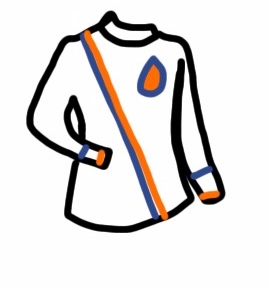
Jared also sent in this concept for the Oilers.  I like the sash-style striping, it's a unique look which has a bit of history in Edmonton.  I also think this layout of the jersey is the best we've seen from Jared, as it seems to hide some of his execution errors.  There are still some errors though, including the sash-stripe which has a gap between the orange and blue at the bottom but no gap on the upper half.  Also the finer details get lost (which has been a problem with Jared's concepts), most noticeably on the oil-drop which is much more rounded on top than it should be.  In my opinion the only way too fix that problem is to take your time and not rush your concepts.

Enjoy the rest of your day!

November 23, 2014

My Thoughts: Blackhawks Winter Classic and Jersey Ads

Back on November 5th the Blackhawks unveiled the new Winter Classic jersey, then the next day a story was circulating that the NHL was considering putting ads on jerseys.  Today I'm going to discuss those two subjects (better late then never I guess).

Chicago Blackhawks Winter Classic Jersey
Images from blackhawks.nhl.com
When the Washington Capitals unveiled their Winter Classic jersey, the graphics in the stadium used the Blackhawks current logo.  That made me go "hmm" maybe the Blackhawks are just going to use their current road jersey (like the Canadiens in the 2011 Heritage Classic), and I thought to myself "I'd be perfectly fine with that".  My second thought was they might take an older version of their road sweater and put their current logo on it, which was exactly what they did.  The Blackhawks went with a design based off of their 1957-58 road jersey, completely accurate except for the use of their current logo.

I think the jersey is a great choice, I especially like the placement of the secondary logo on the sleeve stripes.  I don't like the choice to use their current logo though, although I understand why the Blackhawks would want to use their current logo, and I don't think the logo choice hurts the jersey that much.  Overall I think this year's Winter Classic will be a great looking game.
Grade:  A-

NHL Jersey Ads
Image from marlies.ca - Image from canucks.nhl.com
My thoughts on the idea of ads on NHL jerseys can be summed up in a very short sentence, which is "IT'S A TERRIBLE IDEA"!!!  The NHL would look like a minor league if their jerseys had ads, and unlike minor league teams they don't need the extra money, the NHL would just be being greedy.  I also think jersey ads would hurt jersey sales, I know I would stop buying them.  Another way to look at this is that many people have said that hockey is like a religion, building off of that you could say that hockey jerseys are like a sacred religious artifact, and putting ads on jerseys would be sacrilege, it's simple a terrible idea.

That being said it wouldn't be the end of the world, I would still watch the NHL just as much as I do now, I would still run this blog, and I'd still make jersey concepts.  Eventually I would get used to the jersey ads, I don't really notice them anymore when I'm watching my second favourite sports league the CFL (although the CFL needs the money a lot more than the NHL, so ads are more acceptable for that league).  It would just be very, very disappointing seeing ads on NHL jerseys, especially on timeless classics like the Canadiens red sweater.
Grade (of the idea of ads on NHL jerseys):  F-

Have a good day!

November 15, 2014

Guest Concept Post #70

St. Louis vs Chicago (Stadium Series), by Scott:
Scott is back with another Stadium Series concept.  Last time he made some fauxback jerseys for a hypothetical game between the Blue Jackets and Sabres, this time he does the same for the Blues and Blackhawks.  The Blues jersey looks like a much improved version of their 1984-85 road jersey, I particularly like having the "Blues" script in yellow.  I'm also a big fan of the Blackhawks jersey, which appears to be inspired by their 1958-59 jersey road jersey (although with their 1941-55 logo) with the secondary logo centered on the sleeve stripes, and also the hem stripes on this concept appear to be based off of the sleeve stripes on that 1958-59 road jersey.  Lastly I have to mention how much I love the red numbers on the Blackhawks jersey, they really stand out and balance the colours on the jersey.

Sonic the Hedgehog NHL Jerseys, by Jared:
We also have more Sonic jerseys from Jared, but this time it's for the comic series Sonic the Hedgehog (these jerseys are for are the Ducks, Rangers, Canadiens, and Canucks).  I like that Jared stuck to colours that the teams currently use this time.  Where this concept could be improved in my opinion are the logos, I'd like to see actual logos used instead of just letters for each team.  The execution also has lots of room for improvement, some of the biggest errors include the sleeves on the Ducks jerseys which are too long and skinny, and the sleeves on the Canadiens jersey that are different lengths.

Thanks for visiting!

November 11, 2014

Remembrance Day Guest Concept Post

Poppy Initiative Concept, by Justin S:
Justin sent in this concept which is very appropriate for today being Remembrance Day.  He suggests that the Canadian NHL, AHL, and CHL teams wear a poppy patch on the front of their jerseys leading up to November 11th.  I think that is a great idea, especially having all three leagues working together.  The presentation of this concept is also top notch, I like the fact that Justin chose the captain of each team too show that poppy patch wouldn't be too crowded.  My one suggestion is to have an outline around all the poppies, as I like how the poppies stand out on the Kamloops and Halifax jerseys, and then the same patches could be applied to any colour background (even a red background).

Lest we forget.

November 08, 2014

Guest Concept Post #68

Sonic Boom NHL Jerseys, by Jared:
Jared starts us off today with some NHL theme night jerseys for the TV-show/video-game Sonic Boom (the teams from top left to bottom right are the Jets, Kings, Rangers, Ducks, Canucks, and Red Wings).  I had never heard of Sonic Boom before Jared sent this in, but after a bit of googling I figured out that the jerseys are meant to look like the characters from the show/game.  I think that works well for the Jets, Rangers, and Ducks, but not for the other teams because the colour schemes don't make sense for them.  The Kings look odd in purple and red, same with the Canucks in orange and blue, and it looks really weird having the Red Wings wearing pink and blue.  In my opinion it would be better if the jerseys kept the teams current colour schemes.

Calgary Flames, by Justin S:
The second and final concept today comes from Justin and it's a very unique black jersey concept for the Flames.  I love how far the yoke comes down on the jersey, that large area of red really gets your attention (in a good way).  Unfortunately I'm not a fan of some of the other unique things done on this concept.  The oval shapes behind the TV numbers look kind of awkward to me, and I don't like piping on the bottom of the sleeves (which I think is supposed to be over where the elbows are reinforced, but I don't think that element should be part of the striping pattern).  Lastly, I dislike the use of the side panels from the Ducks' current jerseys, not only because I don't like when teams copy striping patterns from each other, but also because I feel that it clashes with that awesome shoulder yoke.

Enjoy the rest of your day!

October 31, 2014

Orange Ducks for Halloween

Happy Halloween!  To celebrate the holiday I've applied a Halloween design to the blog for the day.  I also made an orange third jersey concept for the Ducks.

Anaheim Ducks:
This concept is a combination of different Ducks jerseys.  The striping is mostly from their 1993-2006 jerseys, but it has a slight curve to it which is inspired by their 2006-07 jerseys.  The logos and number fonts are from their current jerseys.

Have a good day!

October 29, 2014

Guest Concept Post #67

Video Game Concepts, by Jared:
Today we have four concepts by Jared, including these three video game concepts.  All three of these concepts suffer from the same problem, which is that there is no real striping, instead the panels of the templates were just coloured different colours (that is often called "paint bucket syndrome" or "click-and-fill syndrome").  Also there are no real logos, just wordmarks made up of generic fonts slapped across the jerseys.  That generic wordmark is made worse on the Mii Maker jersey by the fact that it barely contrasts from the background (same with the name and number), it needs to either be a different colour or have an outline around it.

New York Islanders, by Jared:
Jared also sent in this Islanders concept, which unfortunately also suffers from "paint bucket syndrome" and the use of generic wordmarks.  I'm also not a fan of the idea of a black and grey for the Islanders, but that issue is secondary to those other problems.  I've always thought it was lazy to just colour in the panels on a template, and I feel the same about just writing out the team name instead of using a logo.  All of these concepts look rushed, they look like they only took a couple minutes to create.  In my opinion, if Jared wants to improve his concepts he needs to put in much more effort to create actual striping patterns, and take the time to find real logos to use on the front of the jerseys.

Thanks for visiting!

October 25, 2014

Quad City Mallards

Quad City Mallards:
This is my entry into the Quad City Mallards jersey contest that is being held on HJC.  I decided to go with a green jersey with off-white stripes, to give the jersey a bit of a retro look.

Enjoy the rest of your weekend!

October 18, 2014

My Thoughts: Devils' Logo

Hello!  How are you today?  Me, I'm good, thanks for asking.  Enough chit-chat though, lets get to the rest of the post.  Today I'm going to talk about the New Jersey Devils' logo, which is one of my favourites in the NHL.

The Devils, who are named after a legendary creature called the Jersey Devil, were previously the Colorado Rockies before moving to New Jersey in 1982.  Their logo has been the same the whole time they have been in New Jersey, besides switching green to black in 1992.  The Devils have been quite successful with this logo, winning the Stanley Cup three times (1995, 2000, and 2003), and appearing in two other Stanley Cup finals (2001 and 2012).

Why is the Devils logo one of my favourite logos you ask?  Well, I like how it combines an N, a J, devil-horns, and a devil-tail (I've highlighted those parts of the logo in the above image).  With those elements the entire team name is symbolized in one logo, the N and J obviously represent the location part of their name, while the devil horns and tail represent their nickname.  Besides that, I like the overall look of the logo.  It's a simple yet effective symbol that easily fits in with the best logos in the NHL.  But there is one more reason I like the Devils logo...

And that reason has to do with the highlighted areas on the image directly above.  Whenever I look at the Devils logo, I also see the letter D and a hockey stick (I've isolated the alleged hockey stick in a separate image below).  Now I know what you thinking, those areas don't really look like a D or a hockey stick.  I'll admit both the D and hockey stick are far from the perfect shape, and I don't think either of them were intentional, but I still notice them when I look at the logo and that's part of the reason I like this logo so much.

Hockey Stick?

So what do you think of the Devils logo?  Do you see the D and hockey stick I was talking about, or do you think I'm completely crazy?  Feel free to let me know in the comment section below.

Have a good day!

October 15, 2014

Guest Concept Post #66

Columbus vs Buffalo (Stadium Series), by Scott:
Scott created this concept for a hypothetical Stadium Series match-up between the Blue Jackets and the Sabres, but instead of using modern jerseys he uses more of a classic look for both teams.  The Blue Jackets jersey features a simplified version of their original logo, and a striping pattern unlike anything they've worn before.  I think that striping pattern looks quite nice, and Scott's version of the logo looks way better than the original.  I do have one very minor complaint, which is that the pant stripe looks a bit too thin to me.  Now moving on to the Sabres concept which appears to be based off of their original white jersey, but with a few things changed up.  The biggest change is using the "Buffalo" script from their 40th anniversary jersey as the main logo.  Also the colours in the stripes are re-ordered (now going blue-yellow-white-yellow-blue), which is a great looking change in my opinion.  Overall this would be a superb looking game.

Thanks for visiting!

October 13, 2014

Orange You Glad I Said Oilers

Edmonton Oilers:
I'd love to see the Oilers in an orange third jersey, so I created this concept that is mostly based off of their original WHA jerseys.  Something I changed is the shoulder yoke, which is now slightly oil-drop shaped.  I've seen another concept that had a similar treatment for the yoke, but I couldn't find it again so I don't know who to credit for the idea.  Also changed, the hem stripe which is inspired by the Oilers' 2001-07 third jersey, and the collar which is inspired by their 1981-94 jerseys.

Enjoy the rest of your day!

October 09, 2014

Guest Concept Post #65

Winnipeg Jets, by Leo:
The Jets begin their season tonight against the Coyotes (aka, the original Jets), so it's the perfect time to post this Jets concept by Leo.  The idea behind this concept is fairly simple, it's basically the original Jets' 1990-96 road jersey but with the current Jets' logo and colours.  I'm glad Leo used the current Jets' branding, as I feel the new Jets shouldn't use the original Jets' logos (after all that franchise still exists as the Arizona Coyotes).  Execution wise everything looks good, I can't find any mistakes.

Happy hockey season!

October 04, 2014

Guest Concept Post #64

Toronto Maple Leafs, by Jared:
We begin today's post with this Maple Leafs concept by Jared.  The jersey uses a good number of stripes, and has a large "T" as the main logo, which reminds me of the old Toronto Arenas jerseys.  The execution isn't great but it's a big improvement over Jared's previous concepts.  Using an existing font for the numbers and using the line tool for the striping looks much better than doing those elements free-hand.  Some execution errors remain though, the spacing between the lines are inconsistent and the lines are at inconsistent angles.  Also the lines either go over the edge of the template or don't reach the edge at all.  The only way to fix those issues is being extra patient and paying attention to every detail when making concepts.  Presentation wise, I like the fact that Jared put his name on the image, but I'm not a fan of the red background.  I think that background takes the focus away from the jersey too much.

St. Louis Blues, by Leo:
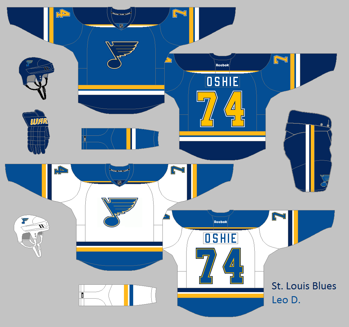
We also have two concepts from first time contributor Leo.  Here he makes a few minor changes to the Blues new jerseys, including swapping the yellow and white stripes on the hem and sleeves of the home jersey, swapping light blue and navy on the hem and sleeves of the road jersey, and adding pant stripes.  I think those changes are lateral moves, they don't really improve the jerseys in my opinion but they don't hurt them either.  Execution is good for the most part, except the back numbers are a bit too far apart and off center.

Chicago Blackhawks, by Leo:
Leo also sent in this Blackhawks Winter Classic concept, which is their original jersey (worn in 1926-27) adapted to the Reebok Edge template.  I'd love to see Chicago wear this jersey in the Winter Classic, I think it's a great idea to bring back the franchise's first jersey, and it would look great matched up against the Capitals Winter Classic jersey in my opinion.  Also, Leo did a very accurate job of recreating the jersey, the only differences are the necessary additions of the players name and TV numbers.  Hopefully we'll see more concepts from Leo in the future.

Have a good day!

October 02, 2014

Fixing the Bolts

Tampa Bay Lightning:
Last week I reviewed the Lightning's new third jersey, now I've created a concept to show what I'd do differently.  First of all I changed the collar-to-cuff striping into lightning bolts, which was inspired by these concepts by Brian Brideau.  I also changed the wordmark on the front from "BOLTS" to "TBL".  Then I brought back the Lightning's famous victory-stripes, and reduced the amount of blue on the pants and socks.

On an unrelated note, I've added a new feature to the sidebar on the right.  There are now tags for each guest concept artist, you can click on a name and see all the posts with concepts by that person.  I'm still testing this feature out, and might remove it if it doesn't work the way I want, but I'm hopeful it will work out.

Thanks for visiting!

September 27, 2014

My Thoughts: September Jerseys

Hello again, I'm back with another "My Thoughts" post.  This time I'm reviewing all the NHL jerseys that were unveiled in late September.

Pittsburgh Penguins Third Jersey
Images from penguins.nhl.com
For their new third jersey, the Penguins brought back a fan favourite design which they won two Stanley Cups in (1991 and 1992).  It's also their first jersey to feature athletic-gold since they switched to vegas-gold 2002.  I love this jersey, it's a classic look that immediately makes me think of Mario Lemieux, Jaromír Jágr, and those two Stanley Cups.  That being said, I wouldn't want this jersey to become the Penguins' new home jersey, I'd much rather it stay a third jersey and something like this concept by Scott be used for the primary jerseys.
Grade: A

Philadelphia Flyers Third Jersey
Images from twitter.com/NHLFlyers and instagram.com/philadelphiaflyers
The Philadelphia Flyers also brought back a previous jersey, albeit one with less history behind it.  They decided to bring back their 2012 Winter Classic jersey as they new third jersey.  I think this jersey is "just okay", I'm not a big fan of it but I don't hate it either.  The striping doesn't say Flyers to me, since it's their first jersey which uses traditional arm and hem stripes and a yolk.  Although there is a bit of history behind the striping, the arm stripes are from their 1984-2001 orange socks, and the black shoulder yoke is reminiscent of the yoke on the old Philadelphia Quakers jersey.  One thing I really don't like is the use of vintage white, I just think normal white would look much better.
Grade: C+

Washington Capitals Winter Classic Jersey
Images from monumentalnetwork.com
Unlike the Penguins and Flyers who just brought back previous jerseys, the Capitals actually introduced something new, going with a fauxback design for their Winter Classic jersey.  I'm not always a fan of fauxback jerseys, but I think the Capitals got it right.  The jersey is inspired by past hockey teams in the Washington area, and the end result really captures the feel of jerseys from the 1920's and 30's.  There is also some cool symbolism in the uniform, the middle of the W in the logo is a silhouette of the Washington Monument (same with the top of the A's), the three white stars in the logo are a nod to the DC flag, and the white and red stripes on the shoulder yoke appear to be inspired by the American flag.  There are a couple elements that I'm not yet sure if I like or not.  I kind of think the W in the logo needs a white outline, but that might make it seem less retro.  I have the same concern about the darker shade of red, part of me thinks the Capitals normal red would look better, but the other part of me thinks the darker shade of red adds to the vintage feel of the jersey.  The one change I'd definitely make would be to move the hem stripes closer together, as the gap currently looks to big when compared to the spacing on the yoke and sock stripes.  Those concerns are very minor though, overall I think this is a great jersey for a Winter Classic.  And there's no vintage white!
Grade: A

Tampa Bay Lightning Third Jersey
Images from lightning.nhl.com
The Lightning were the latest NHL team to unveil a new jersey, introducing a black third jersey with their "BOLTS" wordmark on the front.  I've never been a fan of that wordmark simply for the fact that it uses a nickname, it would be like if the Canadiens wore a jersey that said "HABS" on the front.  Besides the logo I actually think the rest of the jersey is decent, not great but decent.  I think the striping looks good, it may not be a very interesting design but I don't need to be excited by a jerseys striping pattern (for example I like the Blue Jackets home jersey and the Ducks 2006-14 home jersey, two jerseys other people call boring).  One negative many people have pointed out about the striping pattern is that it's similar to the Kings home jersey, and while I do see the similarities, there are enough differences that I'm not immediately reminded of the Kings when I look at the Lightning's new jersey.  Moving on to the equipment, I think there is to much blue on the pants and socks.  Simply switching the blue and white on those two elements would look much better in my opinion.  Looking at the uniform as a whole, I think it's a slight improvement over their previous third jersey (which I wasn't a fan of, I ranked it as the league's fifth worst jersey in 2012).
Grade:  C+

So those are my thoughts on the new NHL jerseys that were introduced in September.  If you have any thoughts on these jerseys, don't hesitate to leave a comment below.

Enjoy the rest of your weekend!

September 23, 2014

Guest Concept Post #63

Disney Concept, by Ricky:
For this concept, Ricky designed jerseys for Ridgewood High (from the Disney series Liv & Maddie) and Brewster High (from the Disney movie Hatching Pete).  I don't know anything about the show or movie, which means I have no context for judging this concept, so I'll just review the aesthetics of the two jerseys.  The striping pattern for the Ridgewood jersey looks great, the Coyotes third jersey pattern and the Bruins style yoke look like they were made for each other.  I'd go with another logo though, as the wordmark feels to squished with the side-panels.  Moving on to Brewster, I'm not a big fan of their jersey.  Combing elements from different jersey doesn't work well in this case, they don't look like they belong together.  I'd also recommend using either white or red numbers, the gold numbers don't look good on the green background in my opinion.  Lastly I think red pants would look better, and I wouldn't use the Rangers' pant-stripes as I think that design is too retro to work with the modern jerseys (that actually applies to Ridgewood's pants as well).

Have a good day!

September 10, 2014

Logo Updates

Hello folks!  Today I have a couple of logo updates to share with you, the first being a very minor alteration of this blog's logo.

Like I said it was a very minor change, mostly I was just fixing a few inconsistencies with line widths and spacing.  The only change that is at all noticeable is the "SG" and "94" parts are now a bit closer to the middle.

SG-94 Jersey Concept:
After I updated the logo, I thought I should make a jersey concept for the blog (something I haven't done since I was using the shield logo).  I've noticed the blog's logo doesn't look very good alone on the front of a jersey (although Jake88 showed us it works if there is a chest stripe behind the logo), so I turned the entire logo into a chest stripe.

Also I updated the eagle-talon/E logo I made back in March.  I altered the thickness of some lines, and angled the gap where the claws meet up with the E.  One day I'll update the eagle-head logo I created back then, but I'm waiting until I have a bit more skill at making logos (which might be a while).

Eagles Concept:
Lastly, I re-made the Eagles jerseys using the new E-claw logo as the main crest.  The blue jersey is basically the same as it was back in March, but I flipped the hem-stripes to match the colour order on the road jersey's hem.  The white jersey now has blue on the top of the sleeves, but besides that there is not much different.

Thanks for visiting!

September 08, 2014

A Few Guest Concepts

Blenheim Blades, by Alan:
To start us off today Alan sent in a couple concepts for teams in the OHA Great Lakes Junior C hockey league (he also included a couple of links on each concept which I've added below the concept).  This concept is for the Blenheim Blades, a team who has been around since 1965.  I like the striping patten used for this concept, it's unique but not too crazy.  I also like the decision to remove red from their colour scheme.  The main logo is just a bit too busy right now in my opinion, I think it would be perfect if the spokes were removed.  The shoulder logo looks great how it is now.

Wallaceburg Lakers, by Alan:
Alan's second OHA Great Lakes Junior C concept is for the Wallaceburg Lakers, who have been around since at least 1972 (I think).  The primary logo (which Alan created) looks pretty good, the only change I'd suggest would be to make the wave pattern more even and symmetrical.  The jerseys also look good, I like the wavy-striping pattern and the over-sized yoke on the white jersey.  Lastly, the name and number fonts are both good choices in my opinion.

Calgary Flames, by Jared:
We finish today's post with this Flames concept by Jared.  His execution still isn't very good, but looking past that I don't think this design is very good either.  The whole jersey looks very empty and bland, most of the jersey elements (stripes, numbers, and logo) need to be thicker in my opinion.  Also, I think the logo, names, number, and collar all would look better with red included.  Another issue is that the players name is too large, and using Iginla isn't a very good choice since he hasn't been with the Flames for over a year now.  My final complaint is that the logo doesn't look good with the flames going the other way, it doesn't flow nicely and it makes the C look awkward.

Enjoy the rest of your day!

September 04, 2014

A Couple of Guest Concepts

Pittsburgh Penguins, by Scott:
The Penguins could use a new set of jerseys, and this set here by Scott would be a great way for them to go.  I love how this concept honours the Penguins history with the contrasting colours at the top of the arms, while at the same time being something new and fresh.  The shoulder logo also looks great with the robo-penguin inside of the roundel, and I also like the fact that Scott kept vegas gold.

St. Louis Blues, by Scott:
Scott also sent in this concept which tweaks the Blues new jerseys by changing up the colour placement on the sleeve and hem stripes.  The result looks great, the jerseys still have a classic look which I loved about the Blues new jerseys, but by limiting navy this concept has a brighter, cheery-er look to it.  The logo was also slightly altered by removing one of the outlines, a move I'm a big fan of, it makes the logo stand-out much better (especially on the blue jersey).

Have a good day!

September 01, 2014

Two Guest Concepts

Oakland Athletics, by Ricky:
Today we have a couple of guest concepts, both by Ricky and both of them are hockey concepts for teams from other sports.  Here he creates four jerseys for the Oakland Athletics.  Starting with the positives, I like the yokes on the primary jerseys, the sleeves on the yellow jersey, the arched player names, and the two colour helmet.  The logos on the first three jerseys also look good, and the Athletics colour scheme is one of the best colour schemes ever.  Moving on to the negatives, there are many elements carried over from baseball that I don't think work for hockey.  Those elements include the light pants, the socks that don't match the jersey colour, the piping on the yellow jersey, and the many pairs of similar gloves.  I also think there is a need for more striping on the primary jerseys, the black jersey, and all the socks.

Arsenal FC, by Ricky:
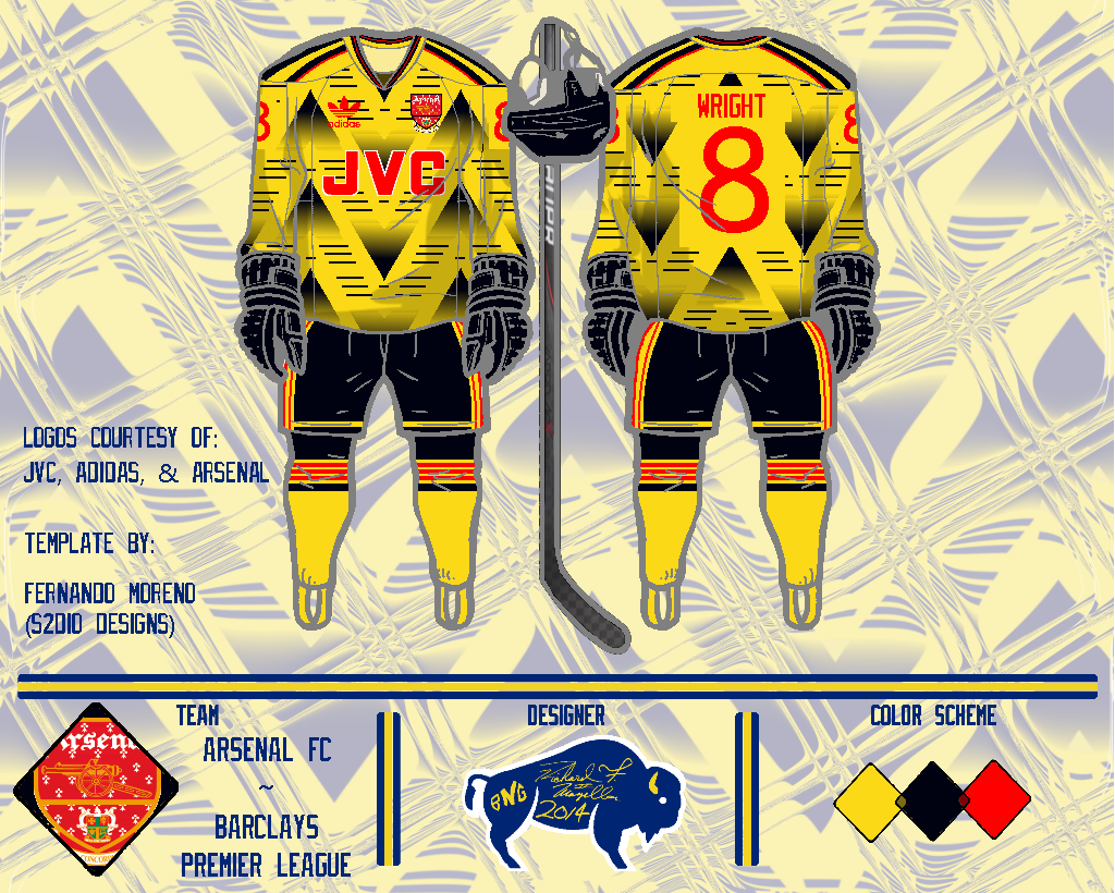
For his second concept, Ricky gives Arsenal FC a hockey jersey with a unique pattern.  In my opinion that pattern is too busy and garish (and this colour scheme doesn't help that fact), it's kind of like the Canucks' "Flying V" taking to the extreme.  The number font isn't my favourite either, it has a kind of childish feel to it.  I do think the striping on the pants, socks, and shoulder yoke could be the start of something good.  One last thing, I think this template looks better when the lines are black, like how they were for the Oakland concept.

Before you go, I thought I'd clarify what concepts I accept on this blog.  Basically I'll accept any concept for a hockey team (so soccer jersey concepts for hockey teams are okay, etc), or any concept done on a hockey template (like the above concepts).  As long as it's related to hockey somehow, and not offensive or anything, then I'll accept it.

Thanks for visiting!

August 27, 2014

My Thoughts on the Blues, and Three Guest Concepts

As you all must know by now, the St. Louis Blues unveiled new home and road jerseys on Monday.  Those new jerseys were based off of the Blues' 1998-2007 jerseys, but had a few important changes.  I personally love the new jerseys, I also liked the jerseys they were based off but I think the few changes make it even better.  Using bolder stripes, straight arm stripes, and adding a small gap in the striping pattern give the jerseys a more traditional look (compared to their 1998-2007 jerseys) that suit the Blues perfectly.
Photos from blues.nhl.com

While I think the new jerseys are basically perfect, there is one part of the uniforms I don't like and that is the socks.  I don't like the fact that the road socks have no navy blue, and the home socks don't really match the home jerseys.  Personally I'd match the socks stripes to the shoulder yoke, as you can see below.

Overall I'd give the uniforms a high A grade.  And while we're on the subject of Blues jerseys, I just want to say that I never thought the Blues' 2007-14 jerseys were that bad.  I've seen a lot of people saying they were the worst or one of the worst jerseys in the league, but I thought they okay (I'd give them a low B grade) Now moving on to some concepts...

St. Louis Blues, by Ricky:
Sticking with the Blues, Ricky made this Blues concept which features a yellow home jersey and the return of red.  He also uses their roundel logo on the front, and the swooshing striping pattern from the Ducks previous jerseys.  Honestly I'm not a fan of any of those decisions.  A yellow home jersey doesn't say Blues to me, I never liked red in their colour scheme, I don't think the roundel is a good primary logo (and the blue-note is such an iconic logo), and this striping pattern should stay with the Ducks in my opinion.

Calgary Flames, by Ricky:
Ricky also made this concept for the Flames, which I'm glad to say I like better than the previous concept.  The striping pattern on the home and road looks good, I like that the cowboy-shirt yoke from their current third jersey is used, but I think a few minor changes could really help.  First I'd make the hem stripe the same thickness as the arm stripes, I'd also remove the piping on the home jersey, and on the road jersey I'd replace the black with red as I think there is too much black right now.  Speaking of too much black, I think the numbers on the home jersey need to be another colour (or re-work the outlines) because they blend into the jersey too much right now.  I'm also not sure about using the roundel as the primary logo, I think it's a good secondary logo but it doesn't work as a primary in my opinion.  The third jersey is really cool, the striping pattern is unique and matches the logo perfectly.

Czech Republic, by Jared:
We end today's post with a Czech Republic concept by Jared that looks more like a Washington Capitals concept.  I'm sorry but I just can't get past the fact that a Capitals logo was used as the main logo for a Czech Republic concept, it ruins the whole concept in my opinion.  The socks also look bad how the panels are just filled in with colour, instead of using an actual striping pattern.

Enjoy the rest of your day!